

Assignment 2 - The Color Edition
Your second Photo Assignment, color theory and how to submit

After seeing so many of your first photo submissions last week, we got a sense of how you see the world through your lens.
You’ve introduced us to your photography style; how you compose a frame, work with light, and choose subjects that carry your vision.
Now it’s time to stretch that vision a little further…
Welcome to Photo Assignment 2: The Color Edition. 🎨
Noticing color
Color shapes how viewers perceive an image, influencing mood, focus, and visual impact. It can feel calm or energetic, subtle or vibrant; often before any other element draws attention.
But here’s the question:
When was the last time you really looked at color?
Not just saw it, but really noticed the blue-gray of a shadow, the warm reflection on a window, or the way two hues quietly vibrate side by side?
This week, we’re slowing down to see.
We’ll peek at color theory (yes, the color wheel makes an appearance 👀), but mostly, it’s about discovery. About noticing the colors that surround you, experimenting, and seeing how they can guide your creativity.
When we started planning The Color Edition, we asked ourselves one question:
How can we take something as fundamental as color theory and turn it into a personal, creative challenge?
Our goal wasn’t to have you memorize color wheels or rigid rules. It was to get you to see. To experiment. To discover how color alone can transform the feeling of a photo.
We tried a few ideas, tested a few approaches, and yes, had a couple of “wait, this actually works” moments…
…and somewhere in that process, we think we found it 😏
What to Expect
Here’s what you’ll find in today’s post:
✨ The assignment itself
✨ Example submissions
✨ How to upload your photo
✨ Why we’re focusing on color
✨ Creative guidance on color theory
✨ A simple workflow to put it into practice
Let’s jump in — Photo Assignment 2 starts now 👇
Your assignment
Pick one of the following colors that resonates with you and let it guide your photograph:
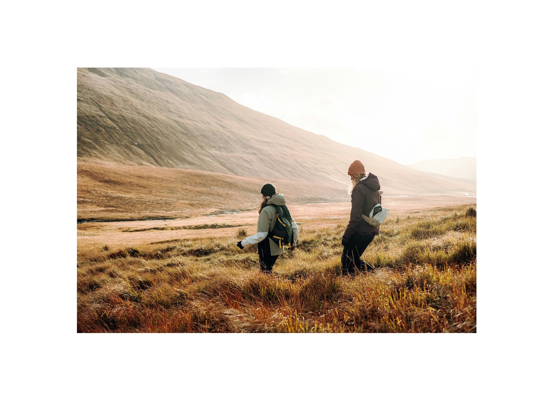
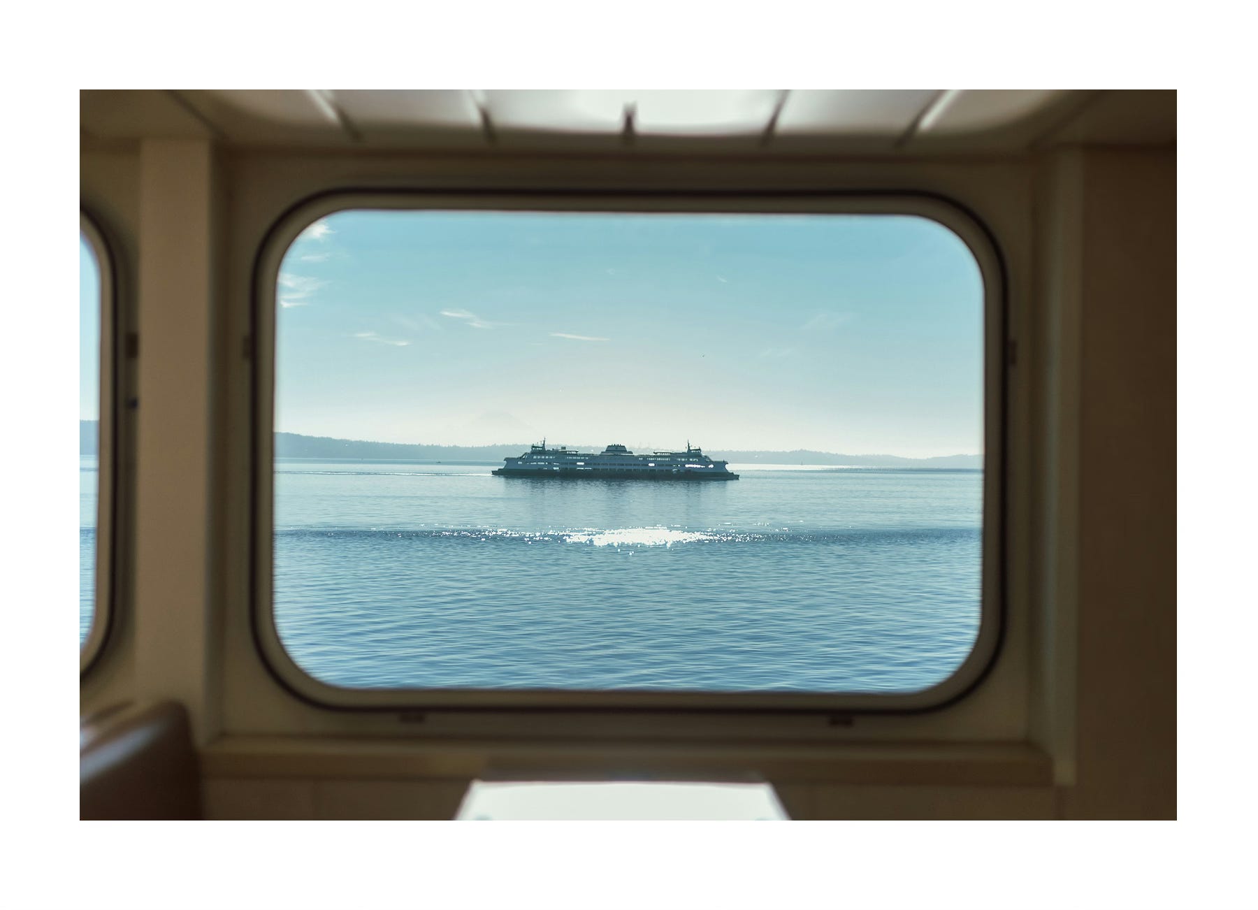
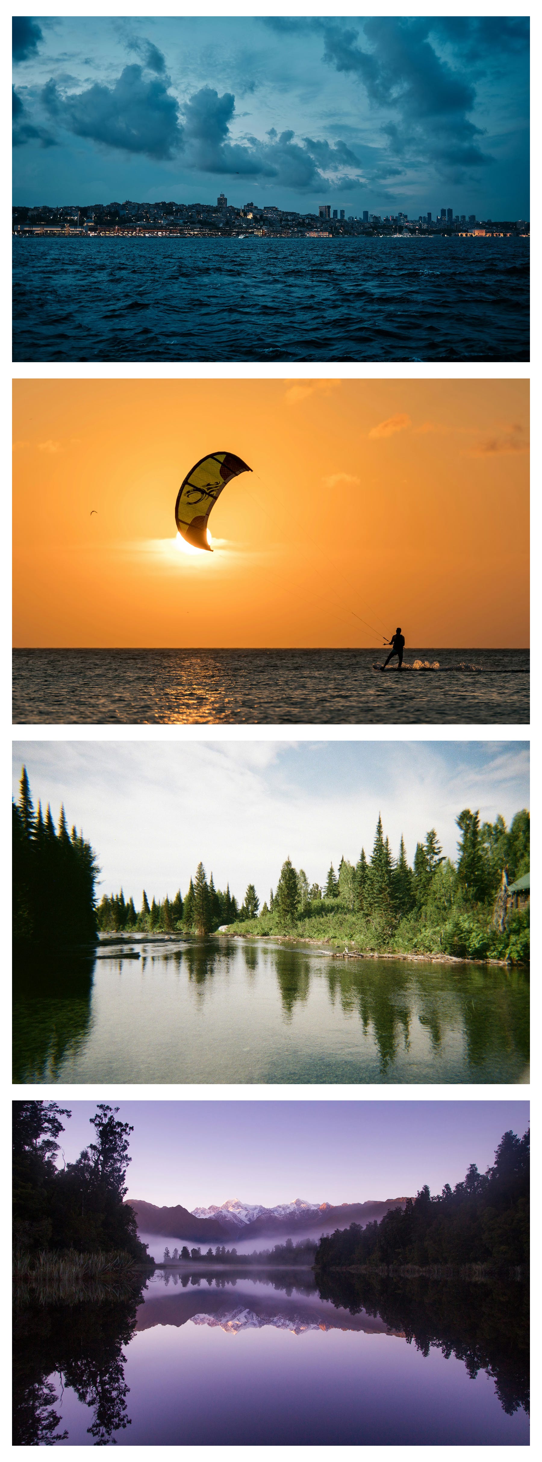
🔵 Blue: calm, trust, serenity.
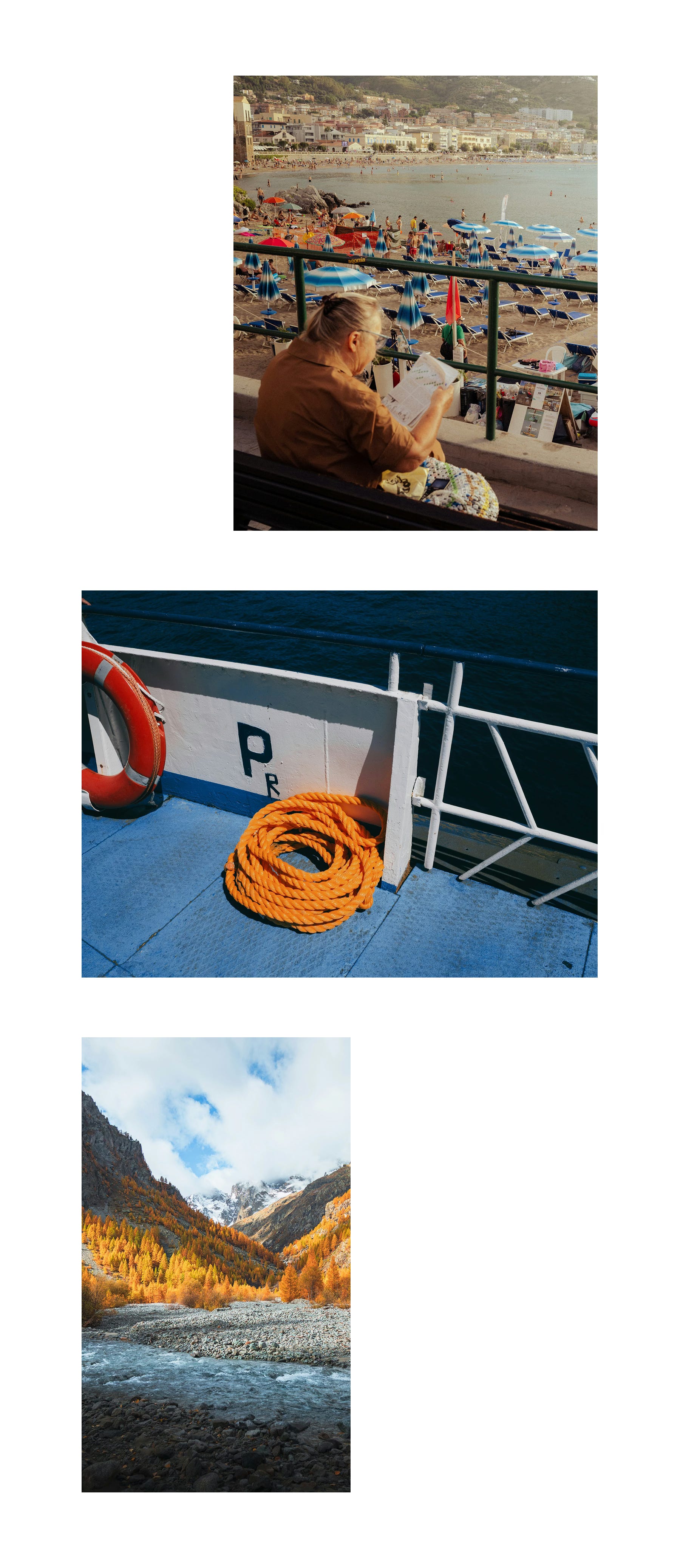
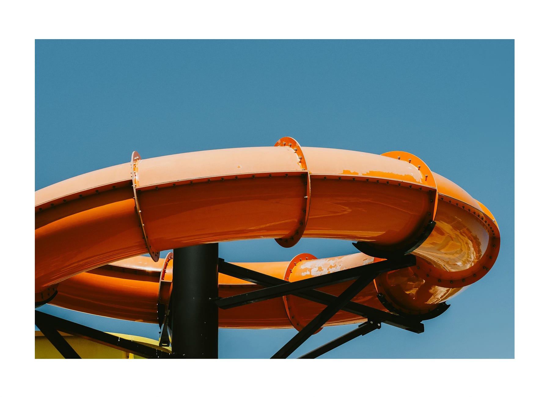
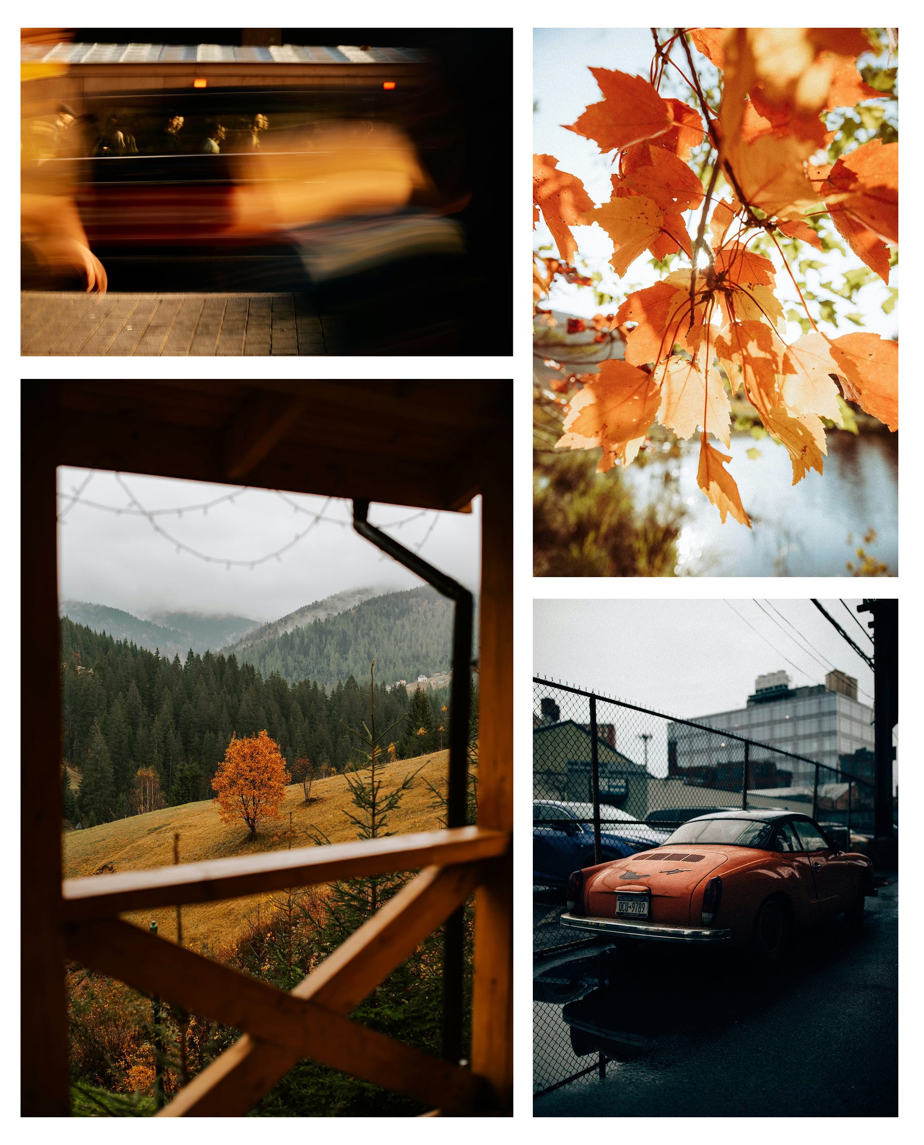
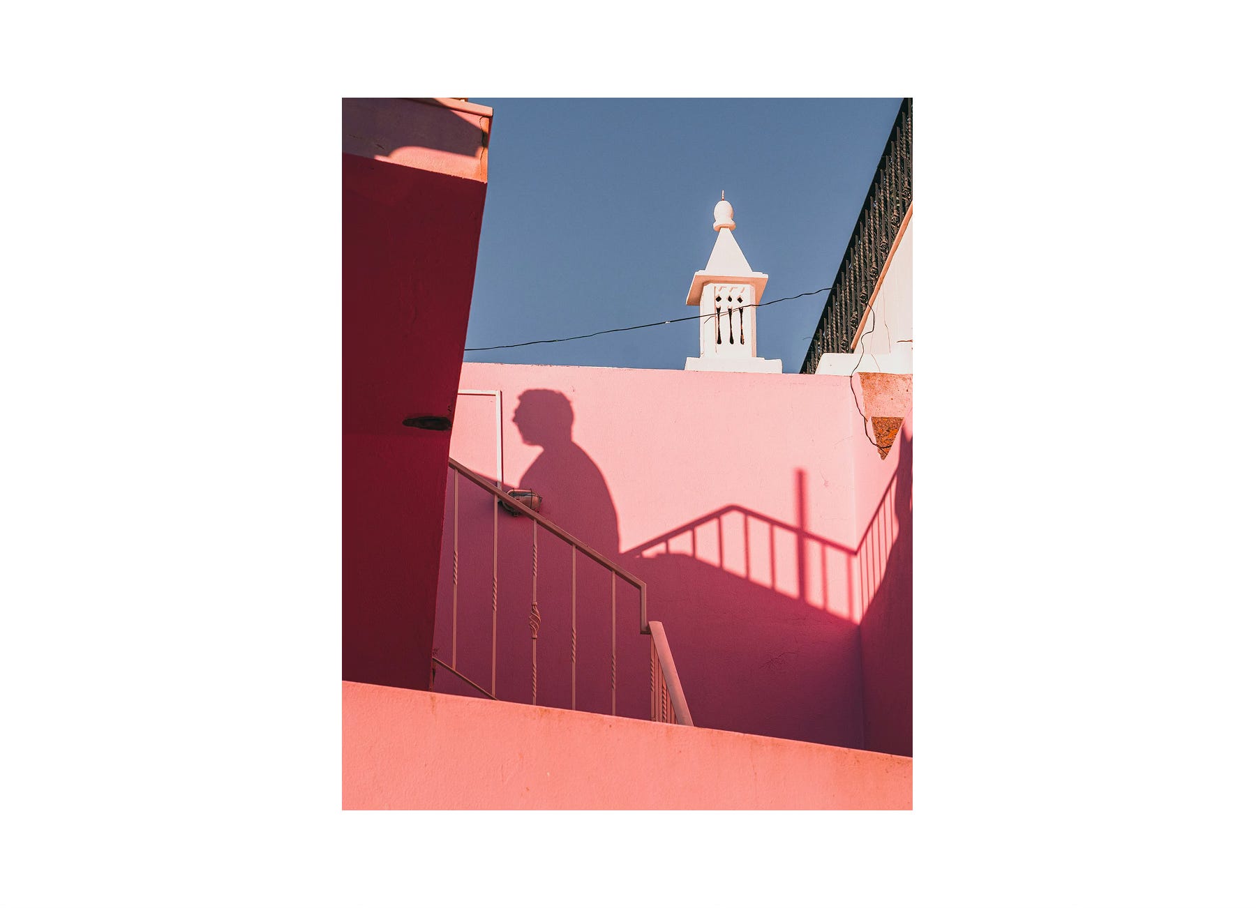
🟠 Orange: creativity, warmth, energetic.
It could be a mood, a single detail that pops, an abstract study in light and shade — whatever feels true to your vision.
Deliverable: One photograph that explores your chosen color; blue or orange.
Theme: Color.
Genre: Completely open — e.g. portraits, landscapes, street, abstracts.
Deadline: Upload your photo to the community gallery within 7 days, by Friday, 24 October 2025 at 23:59 UTC. See the section “How to submit” for details on how to submit your photo.
By participating, you agree to our Terms of Service and Privacy Statement.
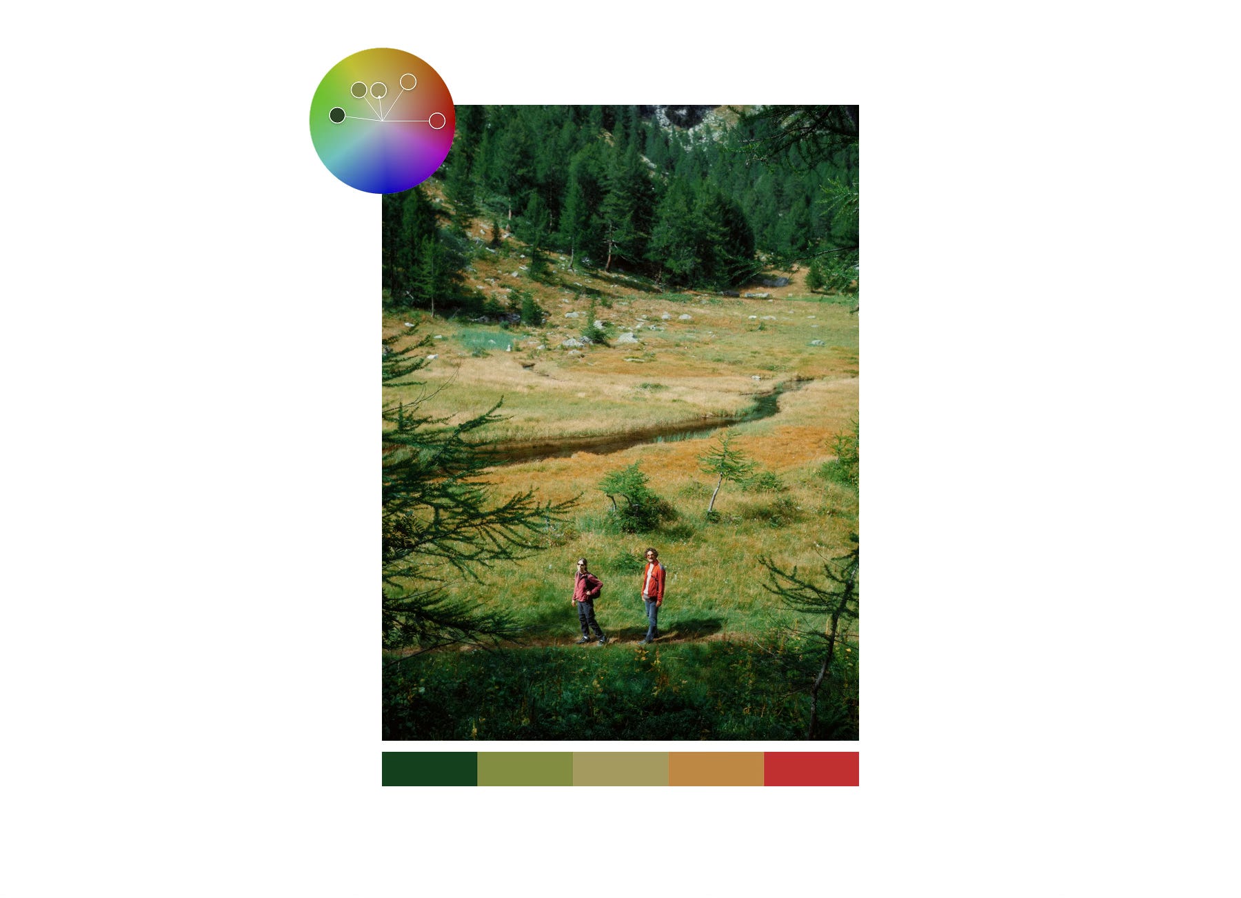
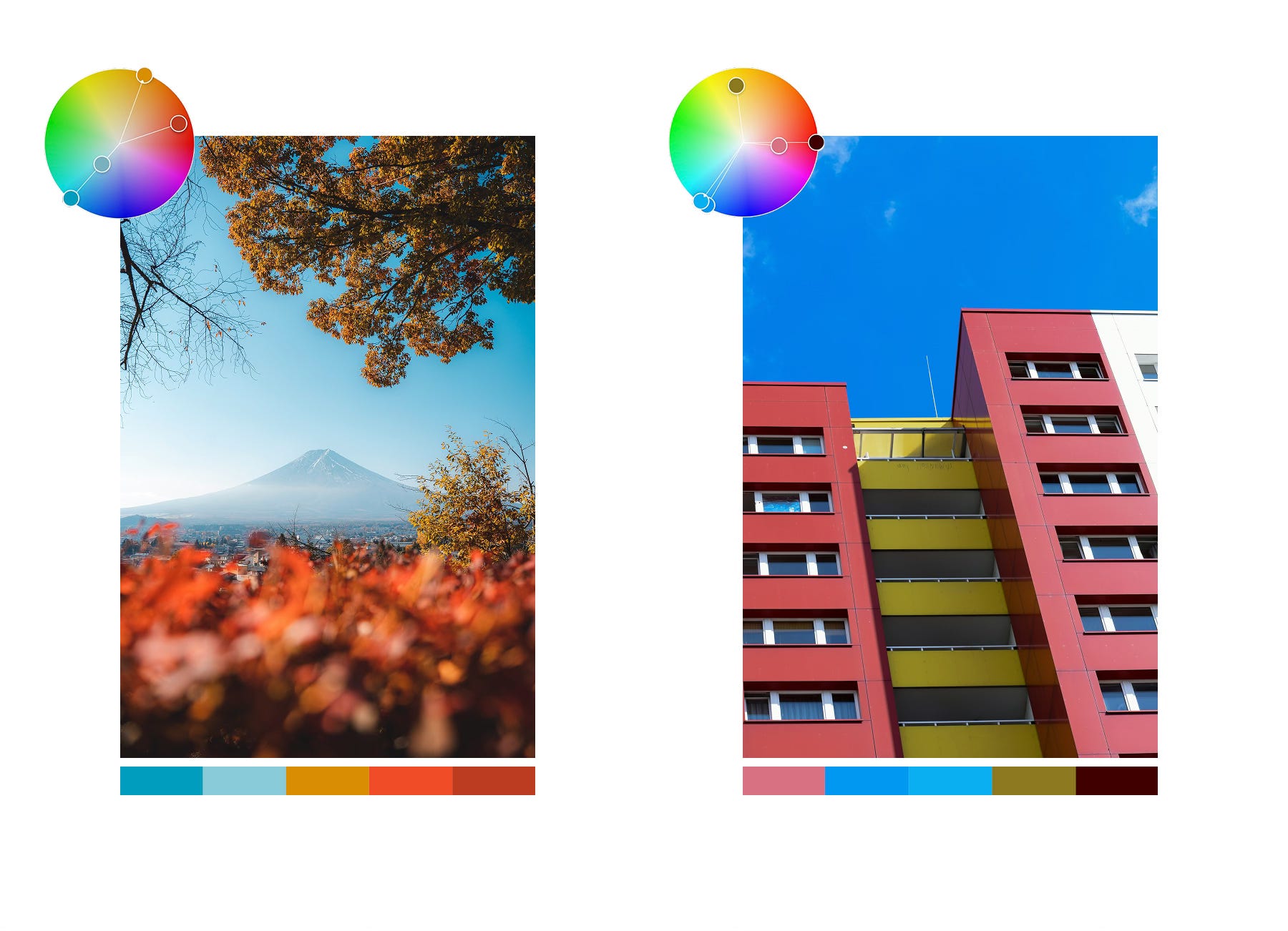
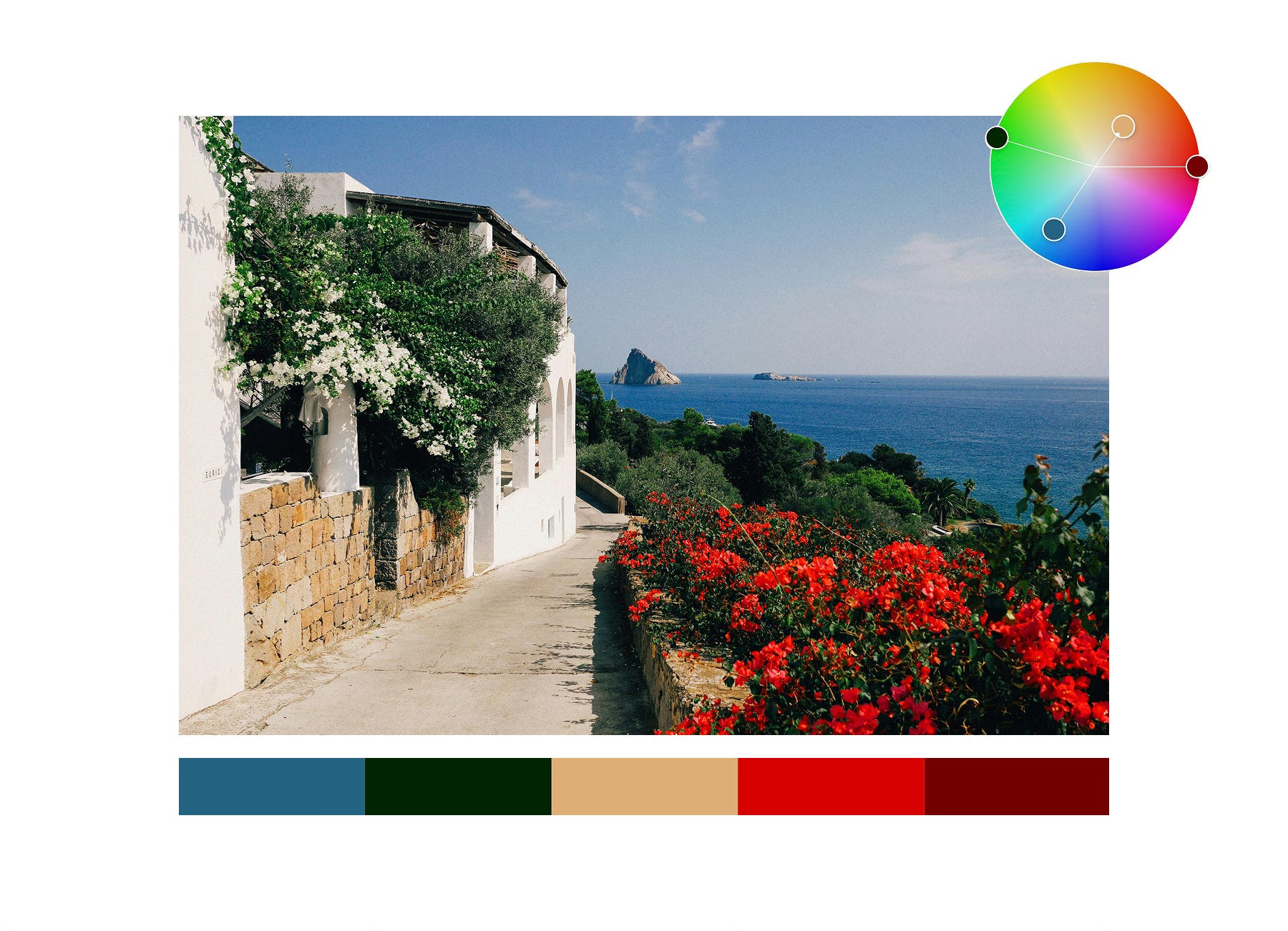
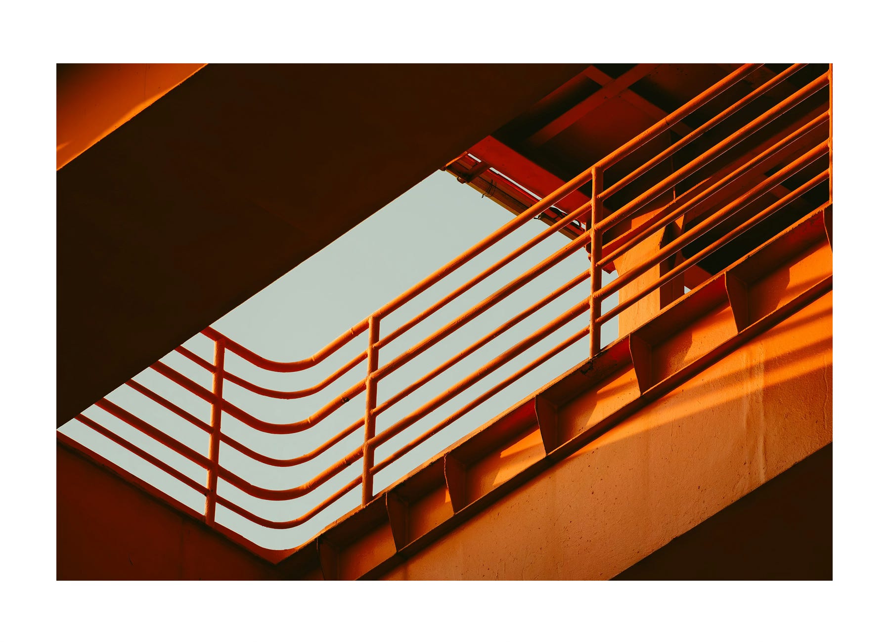
Example Photo Submissions
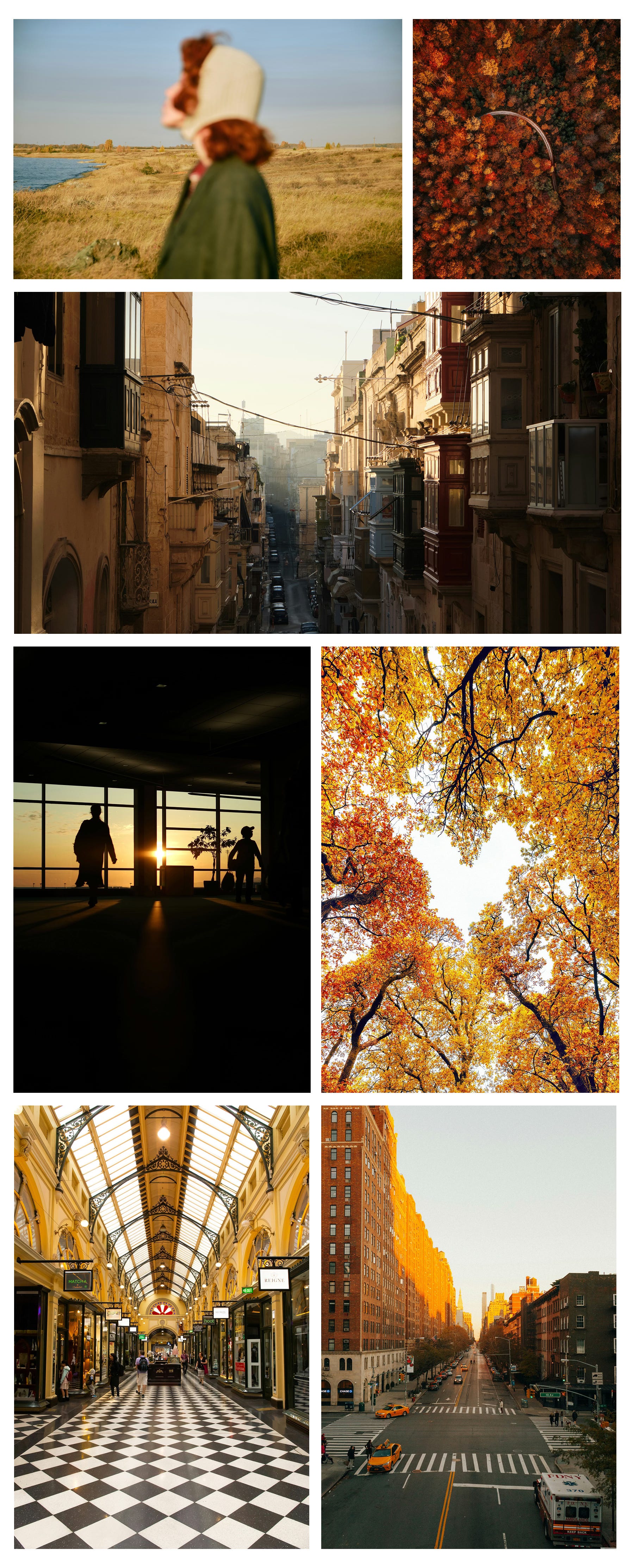
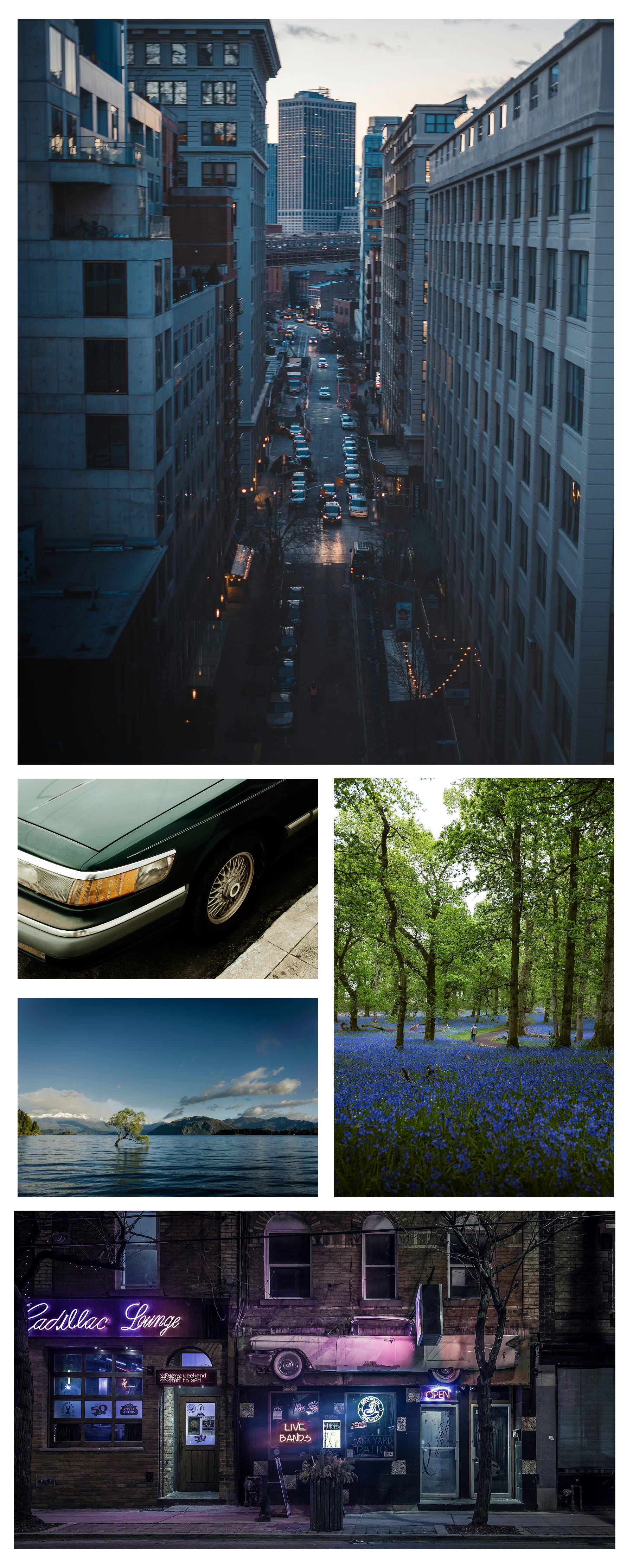
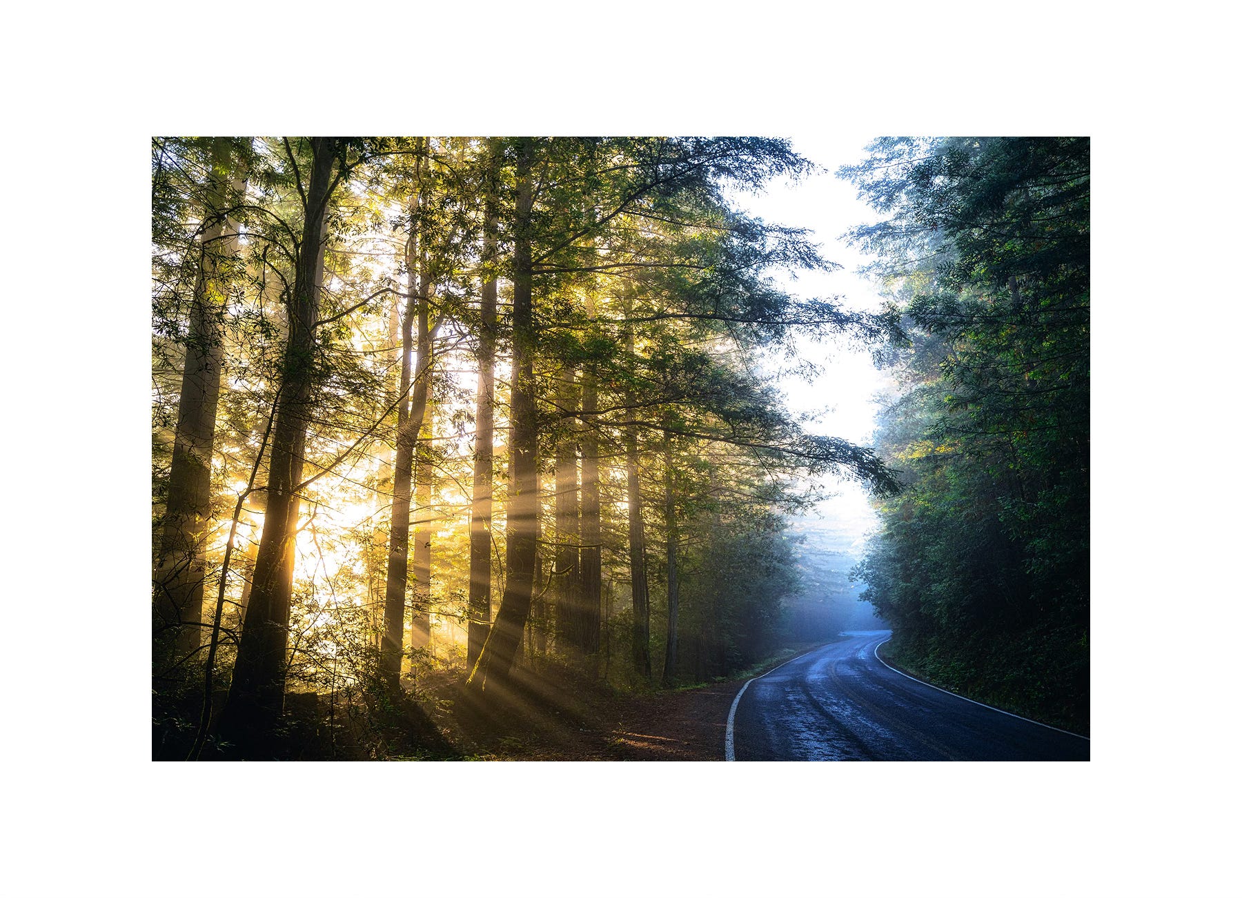
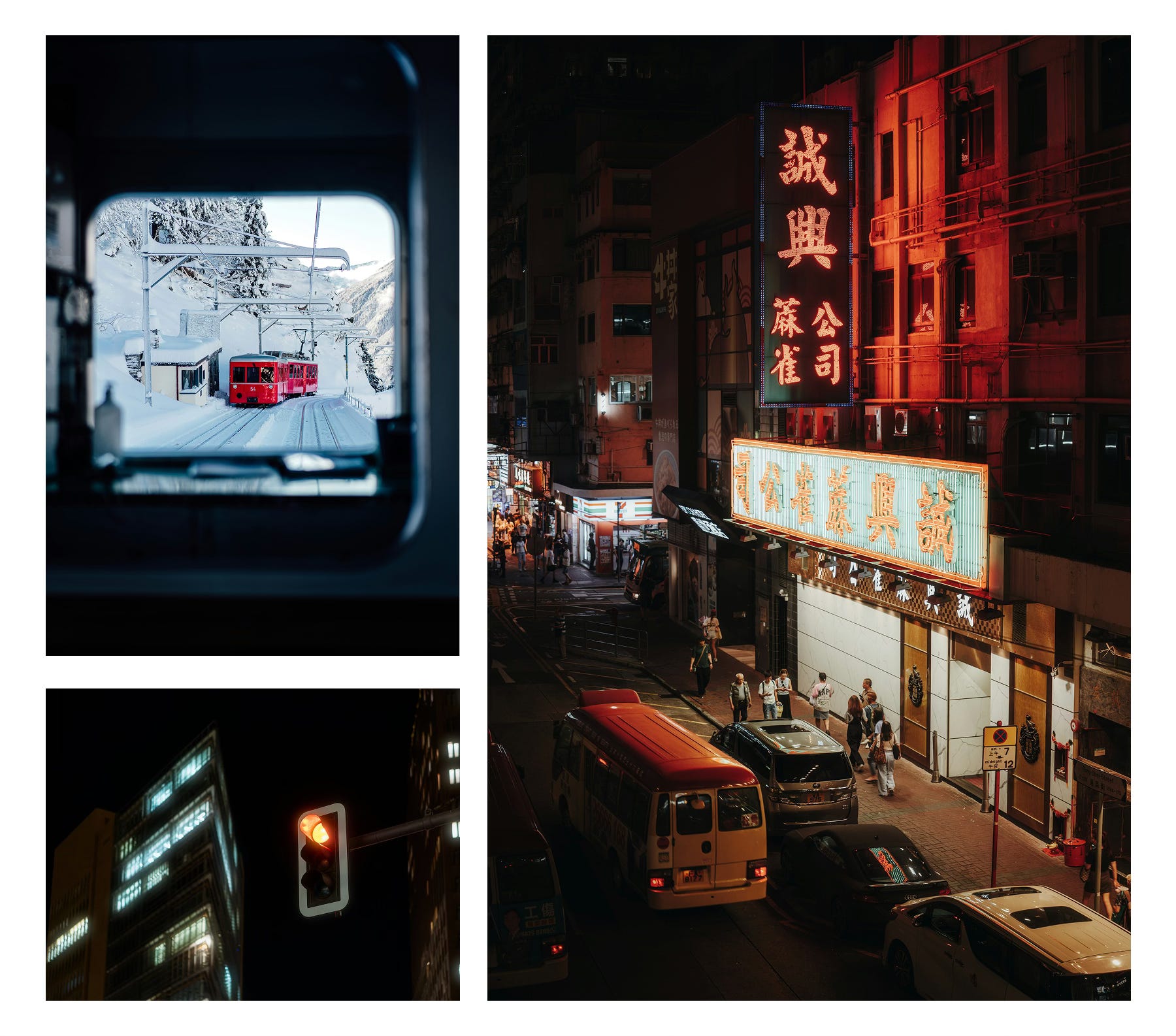
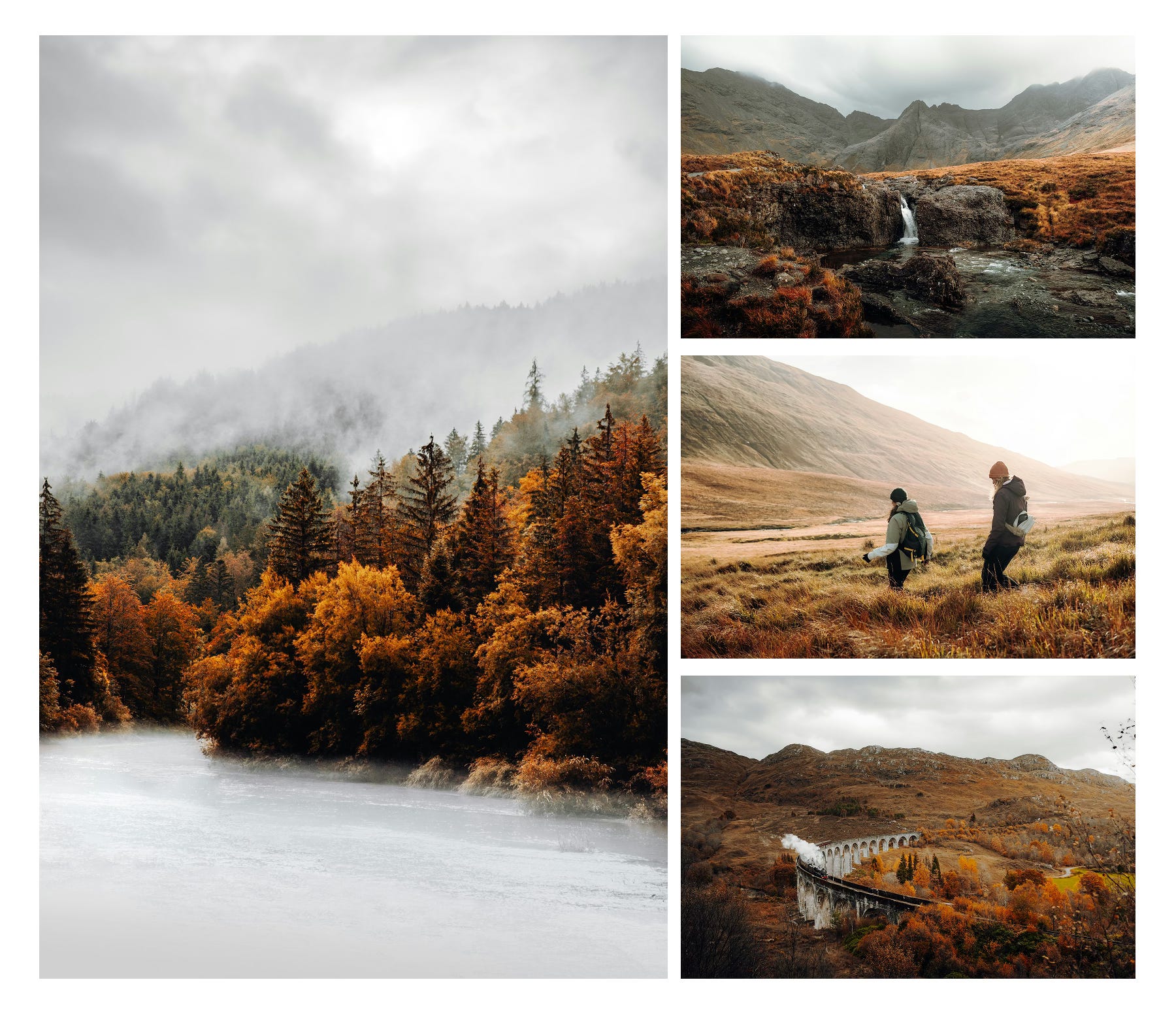
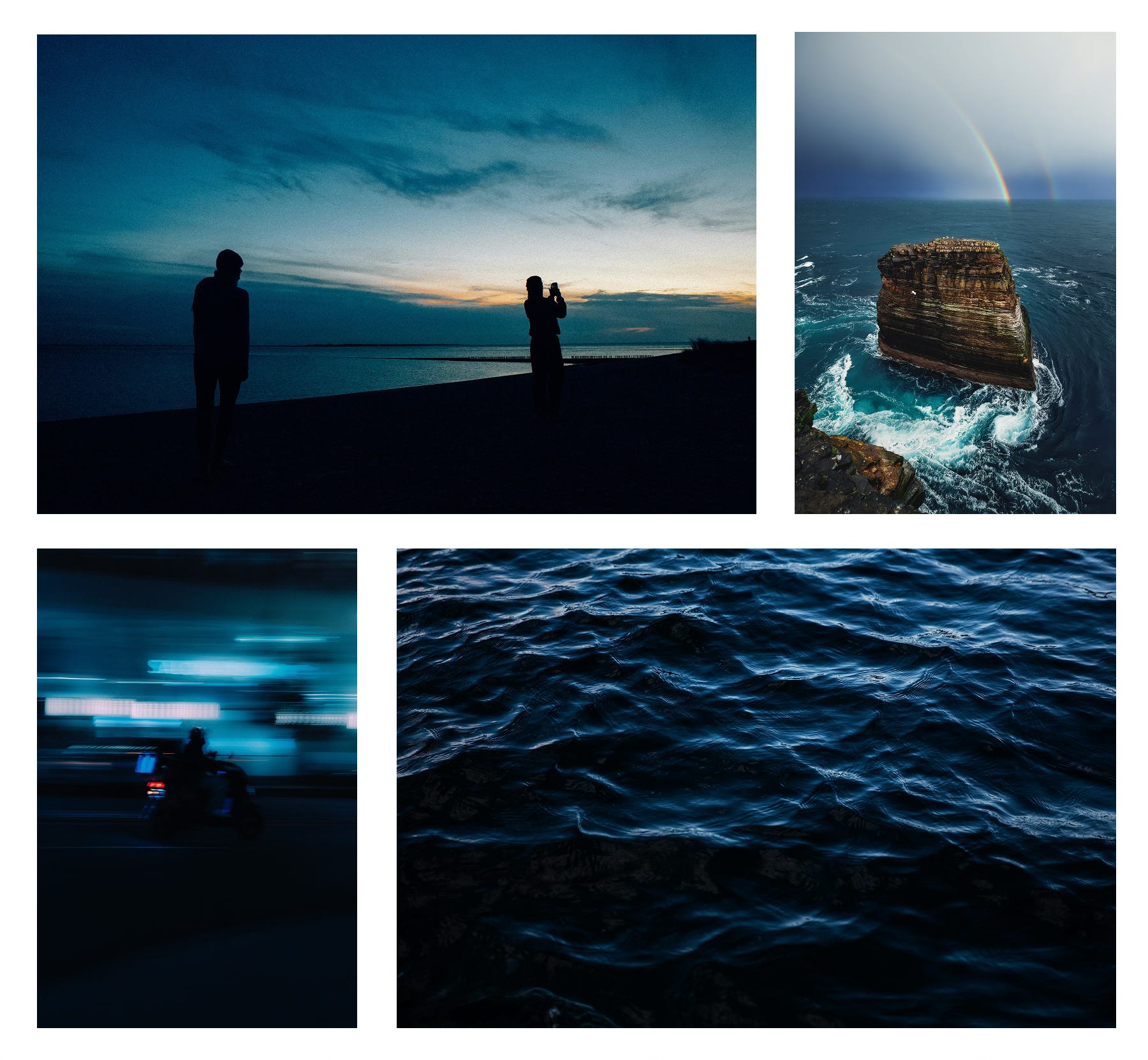
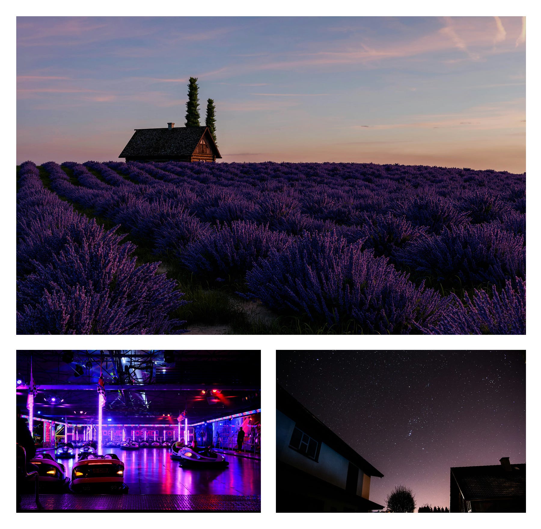
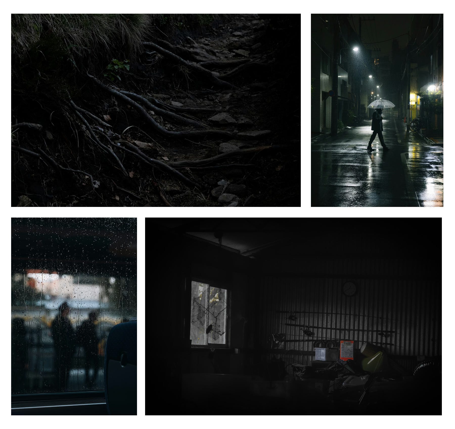
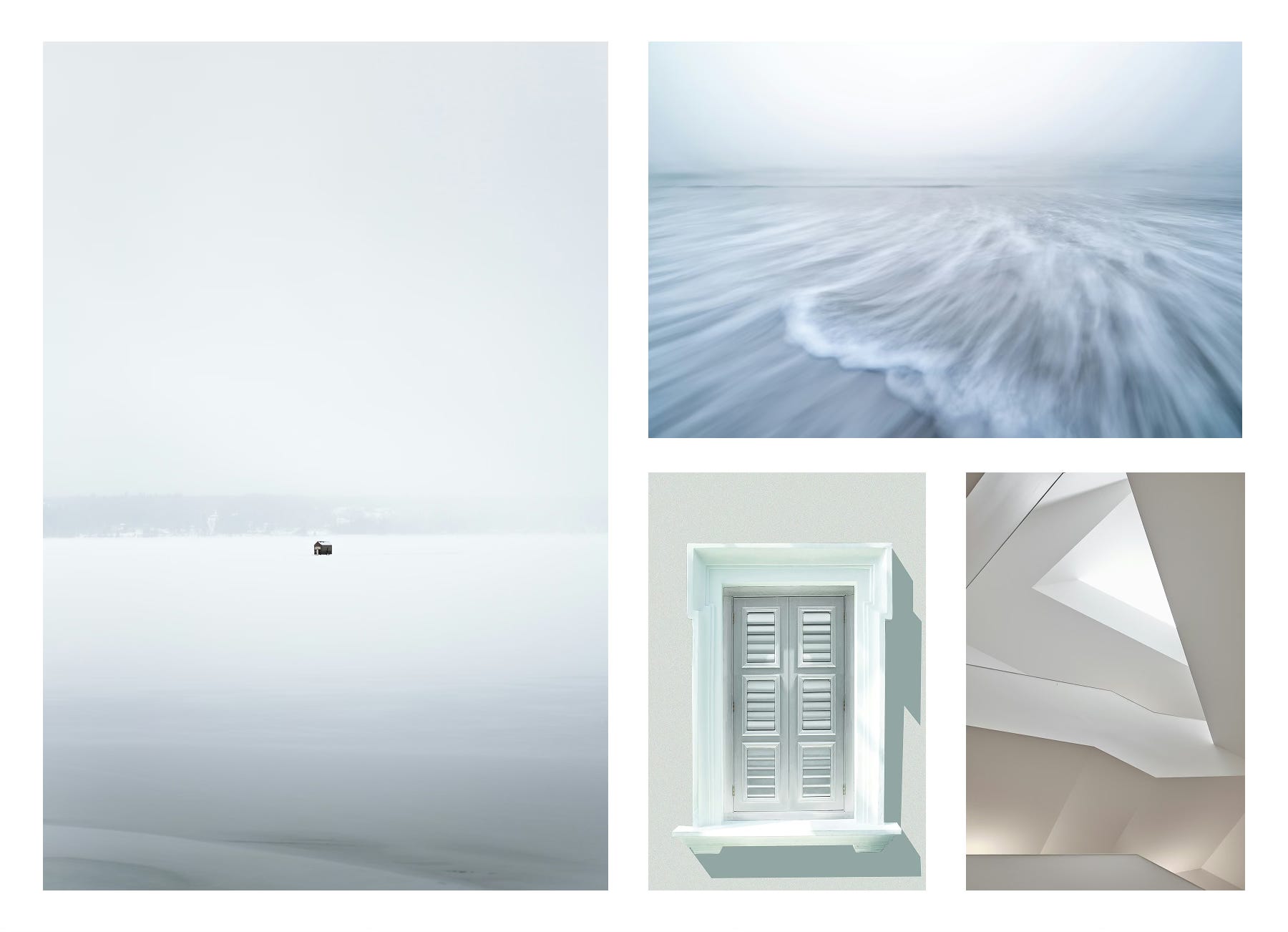
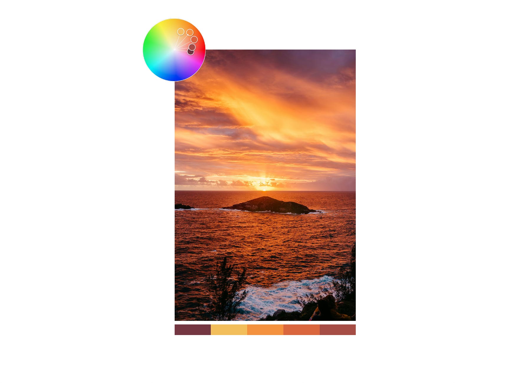
Here is some inspiration for the color blue:
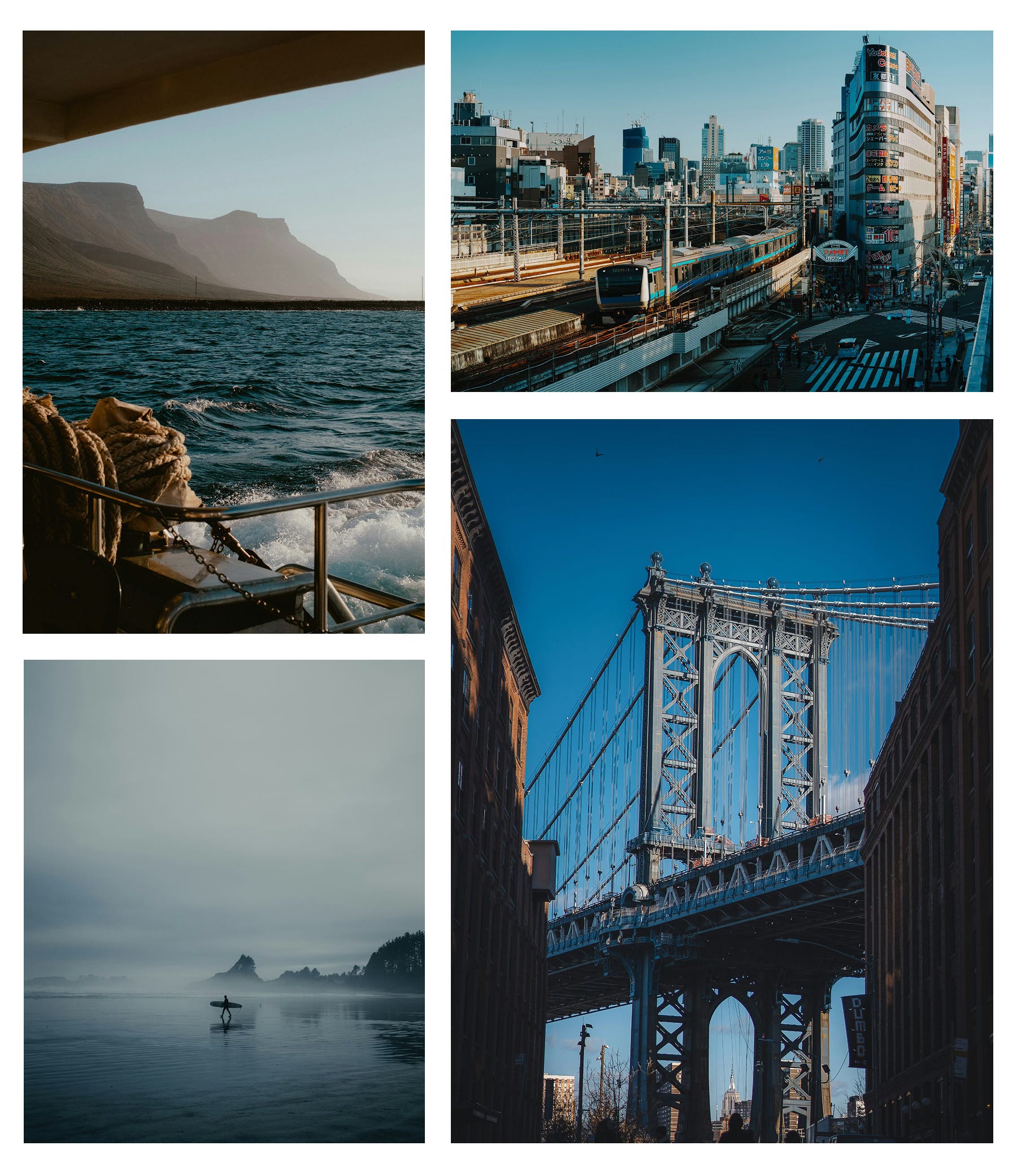
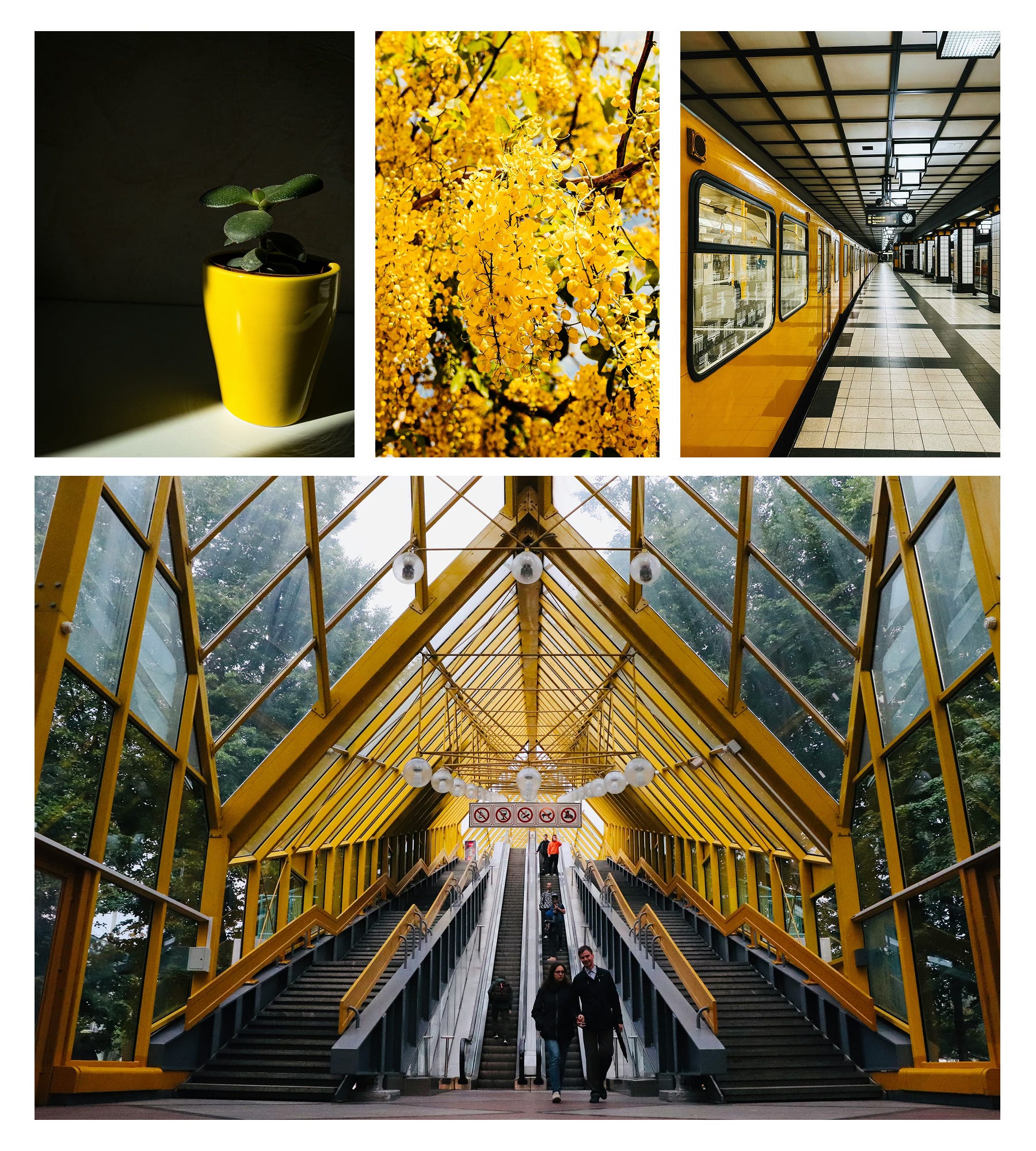
Here is some inspiration for the color orange:
How to submit
We host the community gallery via Padlet. You’ll need a (free) Padlet account to submit your photo.
Click the button ‘Submit photo’ below.
Log in with (or create) a free Padlet account.
Upload your image, add your name & social handle (so we can tag you!), and include a short caption if you want.
Hit publish and you’re in! 🎉
By participating, you agree to our Terms of Service and Privacy Statement.
Why this assignment?
This challenge is all about training your eye to see color.
Dedicate a few days to one color. Photograph it across different subjects, light conditions, and settings. You’ll start to notice how it shifts — how blue turns cooler under midday light, or how orange glows richer at sunset.
Repetition builds visual memory. The more you work with a single hue, the more instinctively you’ll spot harmonies and contrasts, making your compositions stronger and your editing more intentional.
For this assignment, we’ve narrowed the focus to two colors, each with distinct characteristics:
🔵 Blue: cool, calm, introspective.
🟠 Orange: creativity, warmth, energetic.
These colors are opposites on the color wheel, offering complementary approaches to mood and storytelling. One encourages serenity and reflection; the other encourages energy and presence.
Choosing your color is a deliberate part of the creative process. Consider what resonates with you, what aligns with your current vision, or simply what inspires you in the moment.
Creative guidance: Color Theory
Color is one of the most powerful tools in photography. It shapes how viewers feel about an image and how viewers interpret the story behind it. Beyond making a photo look nice, color sets the atmosphere, directs attention, and amplifies emotion.
Understanding how colors interact — and how to use them intentionally — can completely transform the way you create.
1. Temperature: Warm vs. Cool
Let’s start with color temperature.
Color temperature defines atmosphere. It’s one of the most immediate ways to shape how a photograph feels: inviting or distant, energetic or calm.
Warm colors — reds, oranges, yellows — bring energy, light, and excitement. They tend to advance visually, pulling the viewer in.
Cool colors — blues, greens, purples — feel calm, serene, and introspective. They recede into the background, creating depth.
Even subtle shifts toward warm or cool tones can completely change the feel of a photo without changing the subject itself.
It’s important to remember that “warm” and “cool” describe our perception of color, not its literal temperature. On the Kelvin scale, for instance, candlelight (~2500 K) is physically cooler than daylight (~6500 K), yet it feels warmer because of its red and orange dominance.
2. The Psychology of Color
Color carries emotional weight. Understanding these psychological cues helps you create images that feel intentional — not just visually pleasing, but emotionally precise.
Every color can hold emotional associations, though these are subjective and influenced by culture, context, and personal experience.
Viewers may respond subconsciously to color choices, but reactions can vary depending on context and individual perception:
Red – strength, energy, danger.
Orange – creativity, warmth, energetic.
Yellow – joy, optimism, happiness.
Green – nature, freshness, health.
Blue – calm, trust, serenity.
Purple – luxury, wealth, prestige.
Black – sophistication, power, elegance.
White – purity, simplicity, clean.
3. How Colors Work Together
Color harmony is about relationships — how hues interact within a frame to create balance, tension, or rhythm.
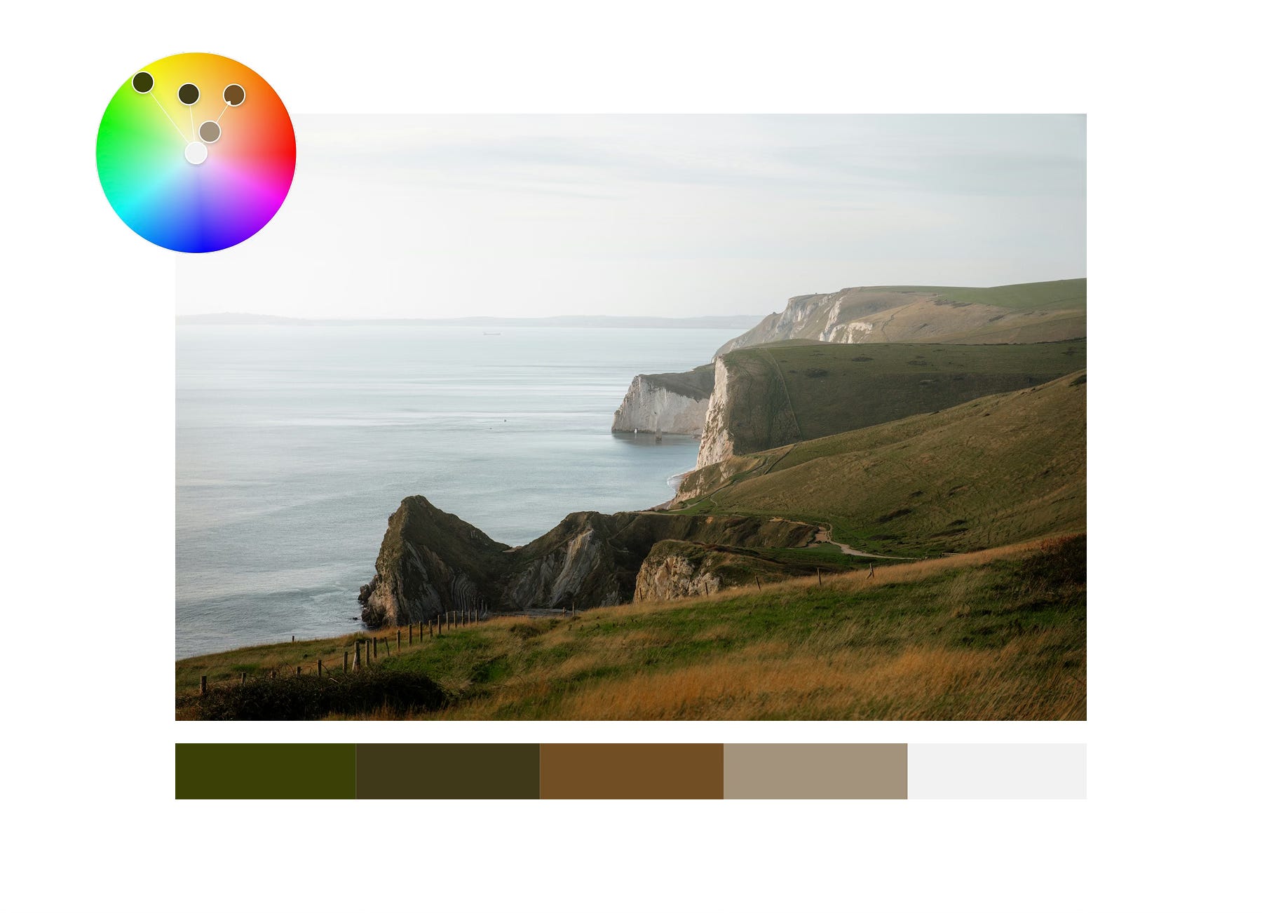
To explore these relationships, tools like color.adobe.com can help you visualize palettes and understand how tones interact in your work.
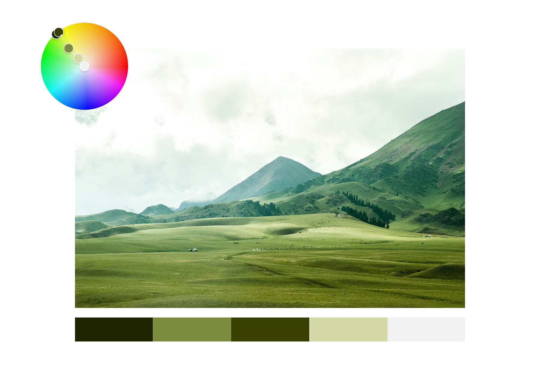
a. Analogous Colors
These are colors that sit next to each other on the color wheel; for example, greens, yellows, and oranges. Analogous schemes are common in nature and tend to feel organic and calm, like the colors of a sunset or a forest.
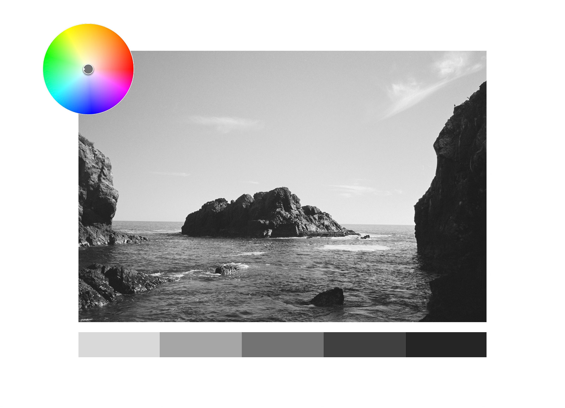
b. Monochromatic Colors
This harmony uses variations of a single hue — changing its value (lightness or darkness) and saturation while keeping the hue itself constant. It creates visual unity and simplicity, allowing texture, form, and light to take the lead.
Black-and-white photography is one form of monochromatic work, but it can also apply to color; such as a range of greens in a landscape.
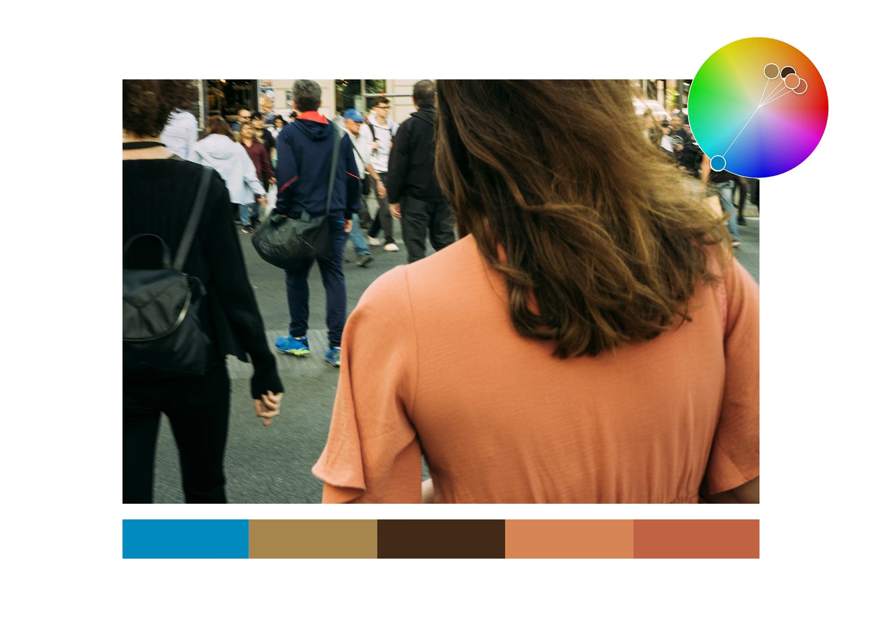
c. Complementary Colors
These colors sit opposite each other on the color wheel — blue and orange, red and green, yellow and purple.
Complementary schemes create contrast and visual tension that draws attention to the subject. It’s one of the most dynamic and popular approaches in both photography and film.
d. Split-Complementary and Triadic Schemes
A triadic scheme uses three colors evenly spaced on the wheel, forming a triangle — such as red, yellow, and blue.
Split-complementary schemes take a base color and pair it with the two colors adjacent to its opposite, forming a “Y” shape.
Both create rich, balanced images with lively contrast.
e. Square Schemes
Less common but powerful, this uses four colors evenly spaced around the color wheel, offering a broad and balanced palette while maintaining contrast.
Bringing It All Together for Your Assignment
Ultimately, color theory isn’t about strict rules; it’s about awareness. The more you understand how colors feel and interact, the more intentional your photography becomes.
You’ll notice details you might otherwise overlook, find compositions through color contrast, and tell stories that resonate more emotionally.
Here’s a quick workflow to guide your week with your chosen color:
Start with your color: Choose your color — blue or orange — and let it set the focus for your week.
Scan your surroundings: Look around for objects, surfaces or light that carry that color. Notice subtle variations — a slightly warm highlight, a cooler shadow, a pop of color in the background.
Build your composition: Place your chosen color intentionally. It could dominate the frame, appear as an accent, or create contrast with other hues. Think about how it interacts with shapes, lines, and textures.
Experiment with perspective: Move around, change your angle, try close-ups or wide angles. Sometimes the color “pops” in unexpected ways depending on framing and light.
Refine: Ask yourself: Does every element add to the story? Remove distractions, or give these “distracting” elements a compelling reason to be there.
That’s it for Photo Assignment 2: The Color Edition.
Pick a color — 🔵 Blue or 🟠 Orange — and let it lead your vision this week.
If you have any questions, ideas or just want to say hi → hello@camerasetup.co
We can’t wait to see what you’ll come up with! :)
Best,
The CameraSetup Team